
Approach
I conducted this audit using both desktop and mobile devices, referencing usability heuristics to analyze consistency and comparing the OneCause event page with those of competitors, contrasting the differences in UI/UX.
Process
I started this project by approaching the supporter site with a fresh set of eyes. As an intern who was previously unfamiliar with the product, I was able to apply my knowledge of UI/UX from the perspective of a user.

After analyzing the supporter sites of relative competitors similarly, I identified the main differences present across the products. Namely, using market research and heuristic study, I took time to compare the supporter site against the functionality of competitors, thereby defining new ways to improve the site.

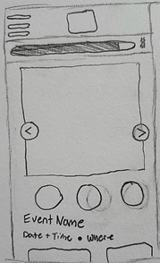
Moving forward with the design, I settled on creating a new navigation menu. Settling in on a hamburger and slide-down menu, I optimized user traffic and accessibility by making the new menu unintrusive, prioritizing visibility. Theses designs were finalized through my LOFI sketches

The HIFI mockups helped to create a more concrete plan of approach, allowing me to have a more formal visual for critique from my coworkers.


Finally with protoyping, we can start to actualize my vision. creating and interactable version of m design. To accomplish this I mapped out what a user flow would look like when navigating this new menu. using that userflow, I was able to visualize those interactions into a functional prototype, which is avaible to demo on the figma file linked at the top.